Today I worked exclusively on the in-game editor for Escape Goat. There is no external editor–no Windows program or special version of the game I use to make levels. Everything I use to create the built-in game will be included with the product!
My goal is to give first-time game designers a toolset for making something. This means making things more user-friendly than I normally would. Usually I just build my editors for stability and speed, but this one’s got to be pretty (enough) and totally straightforward.
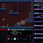
The editor as it existed this morning looked like this:

This version of the editor has been working great so far. I have single button presses for every action, so there’s no need to use a menu for anything. This lets me crank out levels and prototype them rapidly. Though it may be really fast for me to use, I built it and have spent plenty of time with it. I can’t expect someone new to jump into this and understand it.
Just looking at this screenshot, we have several immediate problems:
- There’s text bleeding off the edge in the properties editor, because it’s using the large, in-game font. Speaking of this font, it’s not going to be very good at conveying button names. Can you tell that’s [RT] at the bottom?
- There’s a lot of wasted space at the bottom with the Thing Selector (the big orange box).
- There’s no way to know what each window is at a glance.
- The windows are out of alignment, and the Thing Selector doesn’t even have a proper border.
- Placeholder text for header and footer needs to be replaced with something useful.

- Smaller font can show more text without bleeding off the edge.
- Windows can have colored strips at the top for header text, which can be a simple label (Region Map) or a dynamic label, like the Thing Selector which shows the category name.
- Graphical icons for Xbox controller buttons. This makes such a huge difference.
- Map dimensions changed from 11×4 to 9×5. Almost the same size in room count, and it fits better in the editor.
- Thing Selector shows 3 rows of 8 things at once, which is less overwhelming, and takes up less space.
- The “cheat sheet” on the right is all dynamic depending on where you are in the editor, from the Map Editor to the Room Editor to editing a single gadget within the room. Each strip shows a button, command name, data field, and graphical icon.